30 Brilliant Vector Logo Designs
A proper and distinctive company logo design is of great importance to any business. Strong company logo can brand the product or business in a much better way. A brilliant logo design displays philosophy and objective of the company, and it must be tailored to communicate specific values and ideals in an instant.
However, as the first impression of your company, the final outcome of your logo design is a result of your instruction and creativity of the designer. In this article, we will see 30 excellent logo design examples and find out what makes them work.
Please remember, the company logo is the first step in ladder of distinguished corporate identity if not taken care of properly can destroy the entire image of the business. A successful company logo design not only must have the good look, but also should be thoughtfully designed and capable of taking on a variety of uses. This could include being scaled to a range of sizes, being reproduced in flat color and being printable on paper stock...
1. Koloroo
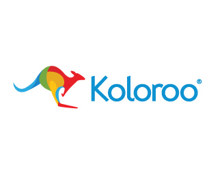
As a color related product the Koloroo logo fits perfectly with its mix of colored random shapes making up the silhouette of the kangaroo. With an attractive type treatment the logo works well as a combined logo design or individually as a graphical mark or typographic label.
2. Core
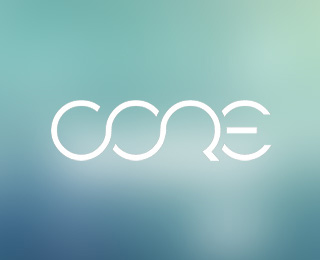
The Core logo design from Rainer Schulz also develops the wording from a single base shape, stripping down the characters and blending together the letters to give a clever but perfectly readable logo design. Using crisp lines and a single color makes this logo design another versatile creation.
3. Eco Café
Bojan Stefanovic's logo design for Eco Café boasts simplistic yet iconic design elements which, combined with the earthy tones, give a real sense of ecology. As a simple mark it has the option of fitting perfectly into a range of uses, from etched window signage to branded crockery for the Café.
4. Castle Print
The Castle Print logo design by Sean O'Grady creates a strong and immediate connection to the nature of the business it is designed for. By basing the graphic on the Subtractive Color Model the logo not only relates directly to the printing industry, but also creates a unique mark by reflecting the company name ('Castle') in the form of a castle icon shaped from the blending colors.
5. Popp
Vlastmil Svoboda's Popp logo design takes the idea of basing a design on type to the next level by creating the complete word from the single base shape. The letter O can be seen repeated on every letter, with small tweaks made to the letter P to differentiate and give legibility to the word.
6. Ta Jevi
Every part of the Ta Jevi logo design oozes fun! The smiling face graphic itself highlights the entertaining aspect of the brand, but together with the arrows of the refresh icon the design symbolizes the deeper message of constantly updating fun. Combined with vibrant colors and a super-cool hand-written type the logo perfectly conveys the entertainment website's values.
7. Pangur
The use of transparency is traditionally frowned upon in logo design, however with modern printing technologies there is little reason to continue limiting the designs of logos. The Pangur Glass Craft design from Sean O'Grady takes a modern slant on its design and perfectly captures the features of glass craft with the stacking of stylized colored glass objects. Combined with the modern Futura typeface it gives fresh and contemporary image.
8. Ryan-Biggs
Bryan Kahrs use of negative space on the Ryan-Biggs logo gives a fantastic illusion of the letters B and R, initials of the targeted company while the slight angle adds depth and dimension to the logo design. All expressed in a single color making the logo adaptable for a variety of uses and contexts.
9. One Leaf
The One Leaf logo design by Choerte combines imagery directly generated from the business name into a single graphical mark. The numeric version of the word 'One' is used as a tree to accommodate the simple leaf graphic. Both relate directly to the business name, as well as to the type of business. The two are also combined perfectly giving a nice smooth flow.
10. Jivespace
The Jivespace logo from Raja Sandhu has an explosive device adding dynamism and depth to the logo design whilst featuring modern values with lower case type.
11. Firefish
Raja Sandhu’s logo design for Firefish is another great example of modern trends such as the use of transparency to create a multi-level and eye-catching mark. Tailoring the stylized flames into the shape of a fish reflects exactly to the brand name which itself looks classic with a mix of small caps and a serif typeface.
12. Friends in Places
The Friends in Places logo is an excellent representation of the worldwide accessibility of online social networking. The busy and dynamic arrows making up the world map produce a distinctive mark that perfectly represents the Friends in Places brand.
13. 69 Monos
Despite being flat, 2D designs, some logos–such as the 69 Monos design from Ruben Van Wijnen–add depth and interest with the impression of three dimensions. Adjusting the angles of the graphic gives a dynamic notion as apposed to a flat and static logo design image.
14. Anti Particle
The Anti Particle logo by Dian Warsosumarto is another great example of a logo design developed with close relation to the business name. Using the letter A with 'particle' graphics is a natural choice with great visual impact. The addition of the blue contrasting particle completely reflects the concept of an 'Anti Particle'. With the logo being developed for a film production company it leaves itself open for some spectacular animated effects.
15. About Thyme
Heading away from the crisp lines and shapes usually associates with logo design, Good Creative’s design for the About Thyme brand has an excellent use of rough, hand-drawn elements, giving a friendly and approachable appearance. Each little icon gives an insight into the key features and values of what ‘About Thyme’ is actually all about!
16. Alatau
The Alatau logo design from Raja Sandhu gives a serious and cutting edge feeling with the widely spaced lettering and array of colored dots. The shapes are also balanced perfectly from the inner two letters, helping the two elements sit together nicely.
17. Therauz Fashions
The Therauz Fashions logo by Sandhya does a great job of combining type and a graphical image. Not only does the sewing needle refer to the concept of fashion, but plays a crucial part in illustrating the letters and holding together the logo design. A perfect designer's touch!
18. Elara Systems
Using soft curves in the type and graphical device gives a friendly appearance to the Elara Systems logo by Maximalist. Bringing in the use of modern trends in the form of three dimensional effects to create a modeled letter E in the logo design fits perfectly with the animation and modeling studio this logo was created for.
19. Black Sparrow
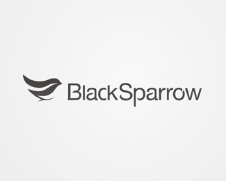
What first appears to be a simple logo design, the Black Sparrow logo from Alex Wende turns out to have some extremely high attention to detail. Everything from the bird icon to the type is tweaked with slight curves and flowing lines pulling together the complete design into a unique and effective branding statement.
20. Greener
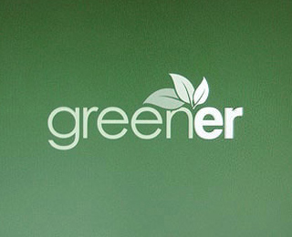
The Greener logo by Tanner Christensen gives a modern impression with varying weights of sans-serif type, but also adds the impression of multiple layers without risking the logo's ability to be reproduced in a single color (always an essential aspect of good logo design).
21. Talkmore
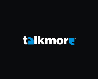
A fine logo design for talkmore uses symbology in the form of quotation marks to replace the letters A and E, creating a clever image that gives a graphical representation of the words and meaning of the brand. The touch of color enhances this effect making the logo stand out and adding to its attractiveness.
22. Swannie Lake
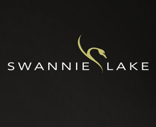
The Swannie Lake logo design from Savera+Co blends the modern sans-serif typeface Avenir with a sleek graphical image than not only fits perfectly with the logo but also adds a subtle touch to the design.
23. Onwine
Perfect type choices and a superb idea from Piotr Chrobot give a sophisticated image for the Onwine logo design, pulling together graphical imagery and type to produce a unique mark that brilliantly conveys the topic of the brand.
24. Spiffy Sparrow
The graphical bird mark of the Spiffy Sparrow logo makes use of intricate shapes, lines and color that could easily progress onto other logo design material to create a stunning brand identity. The use of negative space to produce the body of the bird is a particularly clever touch.
25. About Thyme

Heading away from the crisp lines and shapes usually associates with logo design, Good Creative's design for the About Thyme brand has an excellent use of rough, hand-drawn elements, giving a friendly and approachable appearance. Each little icon gives an insight into the key features and values of what 'About Thyme' is actually all about!
26. Green Dolphin
Mel Campbell's Green Dolphin naturally makes use of the dolphin silhouette imagery and the color green to graphically communicate the text-based information, but also adds a secondary graphic to the logo design in the form of abstract initials that fit seamlessly with the overall design.
27. Vize
Logos don't always need an associated graphic or device. Many, such as Vize Media's own logo design, works perfectly as a text based graphic with subtle typographic treatments. This approach allows the chosen typeface and colors to express the brand values.
28. Tammy Lenski
The Tammy Lenski logo from David Airey takes a journey into the deep meaning behind the use of a paper crane within the logo design. Where many logo designs reflect aspects of the targeted business directly, the Tammy Lenski design takes inspiration from the motivating story of Sadaki Sasaki. The overall effect is not only a great looking brand for the conflict resolution company, but an intriguing story behind the design that reflects the ideals and values of Tammy Lenski.
29. AdMagik
The AdMajik logo by Roy Smith is a great example of balancing and highlighting areas of a logo design with color, using the vibrant magenta to pick out the recognizable business name and the grey to distinguish key points of the logo message.
The use of the simple icon is a great addition, using the title of the letters J and I and combining them with a single shape to produce a subtle rabbit image, relating back to the 'magic' aspect of the business name.
30. Boxbound
Also making use of the modern trends of transparency and three-dimensions the boxbound logo design couples together vibrant colors and a friendly rounded typeface to give a modern, web-based appearance.

-
Logo Maker
-
- DIY professional logo design in minutes
-
- About Sothink Logo Maker
-
It is an intuitive and extremely simple logo design tool for you to fast design high-quality company logo, business logo, web signature, button, icon, etc. Rich built-in templates, preset color & effect styles, and well designed logo images will fully satisfy your needs and make your logo unique. The great editing capability also ensures a smooth and pleasant logo design process.


![]() 100% Clean - No need to worry about installing unwanted spyware or adware. Uninstallation is completely supported.
100% Clean - No need to worry about installing unwanted spyware or adware. Uninstallation is completely supported.
![]() Life-time Free Support - Send an email to our customer service team at support@sothink.com whenever you need help.
Life-time Free Support - Send an email to our customer service team at support@sothink.com whenever you need help.
![]() Risk Free Guarantee - Shop safely in our secure online store. Your data and personal information are protected.
Risk Free Guarantee - Shop safely in our secure online store. Your data and personal information are protected.
Guides
- Design a beautiful and unique logo in 5 minutes
- Logo maker saves your money and time on logo design
- How to print a logo on letterhead from Sothink Logo Maker?
- 30 creative company logo designs for inspiration
- Quickly design professional logos on your own
- Sothink Logo Maker helps you design a beautiful logo in 5 minutes
- 30 brilliant vector logo designs
- Vital tips for effective website logos design
- Create awesome company logo with logo creator
- Ideal choice of logo maker for small business/website/blog owner
- Make the most of a logo maker to build your visual identity
- How to import and re-use vector graphics for logo creation?
- Logo creators VS logo designers
- An easy and fast way to make distinctive sign design

